What do BC Parks visitors want from our website?
Categories:
In the past 12 months, BC Parks has established a program of ongoing design research that gives us direct access to feedback and insights from the people who use our services. This blog is the newest part of that program – this is where we’ll be sharing what we’ve learned so far and what we learn in our upcoming research.
So far, our research has covered public service areas:
- BC Parks website
- Camping reservations
- Day use passes
In this post, we’ll focus on what we have learned about how people use and want to use the BC Parks website.
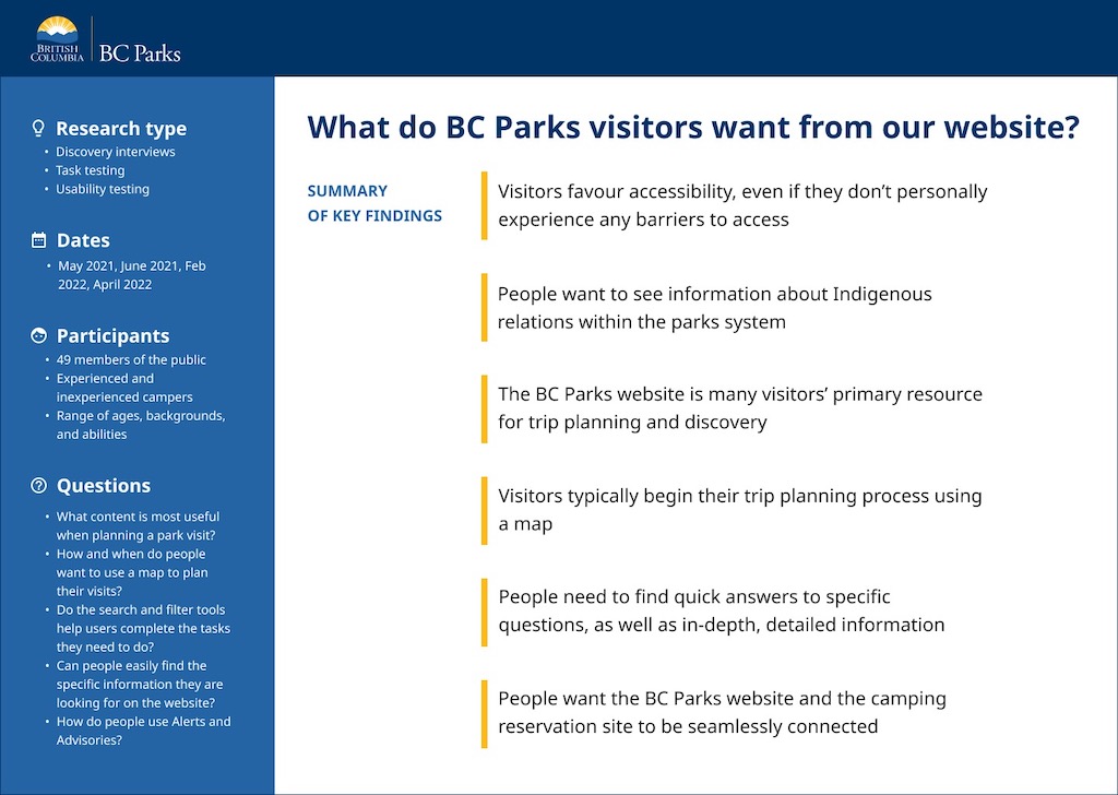
What questions were we trying to answer?
We’ve explored a wide range of questions about the BC Parks website in two main categories.
Broad questions about why and how people use the site, like:
- What information is most important for visitors when planning a park visit or camping trip?
- How and when do people want to use a map to plan their visits?
- What kind of information would they expect to find on a map?
Specific questions about the usability of the new BC Parks website (in beta), like:
- Do the search and filter tools help people find the information they need?
- Can people easily find the specific information they are looking for on the website?
- How do people use Alerts and Advisories when planning or taking a trip to a provincial park?
What were our key findings?
People favour an accessible and inclusive experience, even if they don’t personally have any barriers to access
“I like the photos on the cards, and I like that it shows people who maybe don’t fit like the stereotypical mold of campers. I see people like this when I’m camping but I don’t always see them represented.” – Research participant
Key findings:
- Overall, visitors want the website and all BC Parks services to be accessible and to include everyone.
- In parks, visitors want signs to be more easily readable.
To improve accessibility, we:
- Developed the new website to meet stricter accessibility standards (AA WCAG 2.0 and 2.1). This is a work in progress and the site may not yet fully meet these standards.
- Are working to redesign in-park signs to be more easily readable.
- Are continuing the ongoing work in BC Parks to make them more accessible to more people.

People want to know more about how BC Parks collaborates with Indigenous people
Key findings:
- Visitors want to know how BC Parks acknowledges and respects Indigenous culture and traditional lands.
- Visitors are looking for information about how Indigenous people use the parks currently and have used the land historically.
To improve access to this kind of information, we:
- Prioritized adding information about the collaborative work we do with Indigenous communities to the beta site.
- Added a highlight to the beta site homepage to make this information easier to find.
- Are working in partnership with First Nations to update the information on the website to better reflect their deep connections to the land.
The BC Parks website is many visitors’ primary resource for trip planning and discovery
“I would love help finding parks I didn’t know about in a certain region.” – Research participant
Key findings:
- People rely on the information about camping, activities, locations, and park status when planning and preparing for their trips.
- People want the website to help them discover new parks to visit and new places to camp.
To help people in their trip planning journey, we:
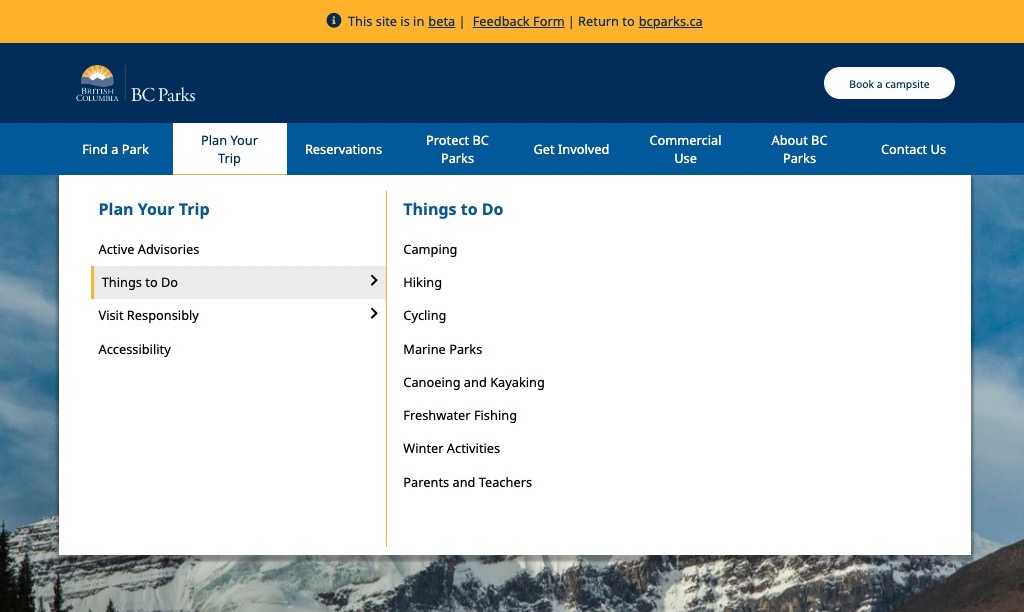
- Created a section called “Plan your Trip” and link to it from the main navigation of the beta website.
- Are re-organizing and rewriting the web content to provide better help in the trip planning stage.
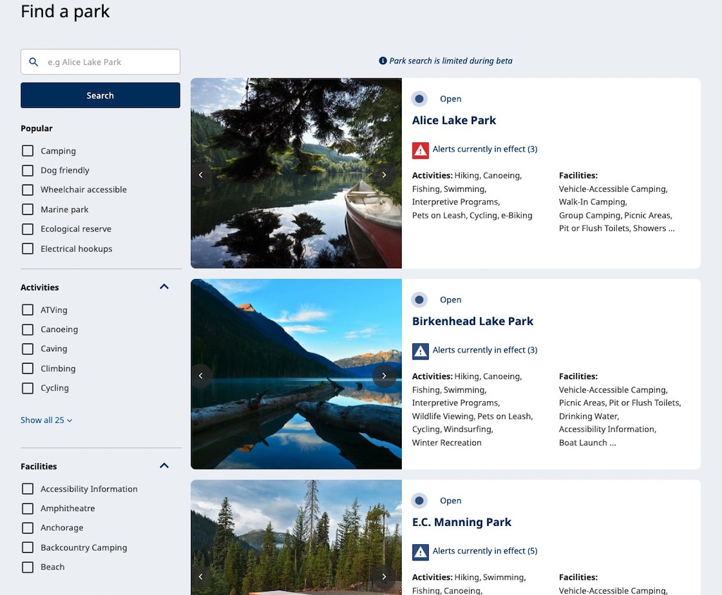
- Added filters to the search results (Find a Park page) to help people to find parks that offer activities or facilities they are looking for.
- Added higher quality photo galleries to each park page on the beta website, to help people get a feel for parks before they visit.
Visitors typically begin their trip-planning process using a map
“The current system is so fragmented with the info… I’d like to see that info all in one spot to get the whole camping picture. Even the private sites!” – Research participant
Key findings:
- Unless they have a specific park in mind, people typically begin their trip-planning process using a map (often Google maps).
- Visitors use maps early in their planning process to find out about parks near home or close to a location they plan on visiting.
- Visitors want to be able to see the entire parks system on an interactive map.
- Visitors want to be able to use a map to view parks within a specific distance from home, or a specific distance from another location.
To make trip planning using a map easier, we:
- Implemented an all-BC view of the camping map on the camping reservations site.
- Are actively exploring options for enhanced mapping on the new BC Parks website and searching for ways we can satisfy more of these user needs soon.
People want a simple search function that helps them find details about a specific park
“I want to find a park or book a campsite. I don’t want to find an adventure.” – Research participant
Key findings:
- Typically, visitors would use the search function on the BC Parks website to search for a specific park name.
- Visitors also want to be able to search by a region or a distance from home (or another location).
- Searching by activity is not a high priority for most visitors. However, once they have a list of parks in a certain region, they do like the idea of filtering this list by activity.
To improve search, we:
- Changed the text on the site search field from “Find your next adventure” to “Find a park”.
- Added more search filters to the search results page.
- Are exploring options for how to satisfy the need for regional or location searches.
People need to find quick answers as well as in-depth, detailed information
“I found it really easy to navigate and the experience was more simplified.” – Research participant
Key findings:
- Many visitors are looking for specific nuggets of information, as opposed to longer, more general information.
- Visitors want to easily find relevant information written in simple, plain language.
- Visitors want to see photos of the parks that highlight geographical features and wildlife that can be seen in the park.
To simplify the content and improve findability, we:
- Are rewriting our web content to meet plain language standards set out by the BC government’s writing for the web guide.
- Are developing a web writing guide specifically for BC Parks to help writers adhere to these standards in the future.
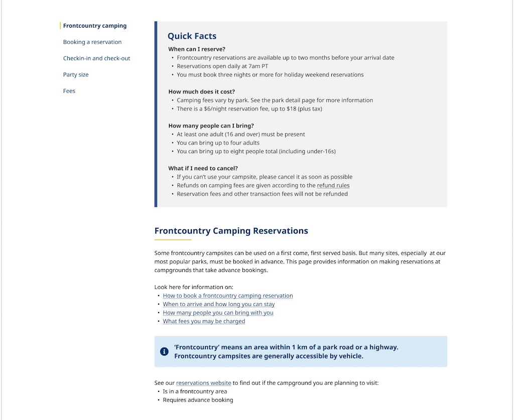
- Added a left-hand navigation to the beta site’s content pages that allows people to jump directly to different sections on the page.
- Designed visual highlights that emphasize the most frequently needed information within a page.
- Have added photo galleries (with big, beautiful photos) to parks pages on the beta site.
Note that some of these changes may not be visible on the beta website yet.
Visitors view alerts and advisories in the days or hours before departing for a park
“It’s valuable for Alerts to be separate from something like ‘there’s trail construction but you can still use the trail’ or ‘bathrooms are being renovated but you can still use the pit toilets’.” – Research participant
- Visitors want to see park closures or other alerts before they depart to visit a specific park.
- Visitors want access to timely updates that would impact their plans.
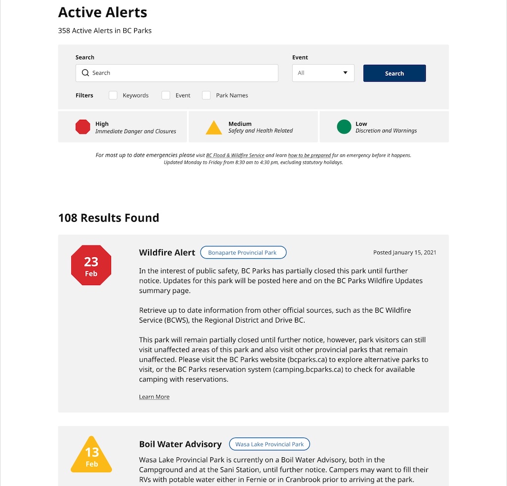
- Visitors want alerts to be clearly identified, so that alerts that would make them change their plans are prioritized and easy to find.
- For colour-blind people, it’s hard to see the difference between the colour-coded warnings.
To make alerts more user-friendly, we:
- Added alerts and advisories on the home page of the site so they are easy to access.
- Differentiated alerts using colour, shape, and text, so it’s easy to distinguish immediate dangers from less severe warnings.
- Added alerts to the park search results page and the top of the park information page, so that users can easily find them.
- Created a tool for parks staff to quickly update alerts when emergencies arise.
Note that some of these changes may not yet be live on the beta site.
People want the BC Parks website and the camping reservation site to be seamlessly connected
“Even if I Google the background for the parks I’m interested in, once I click reserve, they usually re-direct to the [camping reservations] landing page and you have to re-enter all the things again.” – Research participant
Key findings:
- Visitors experience a disconnect between the BC Parks website and the camping reservations site.
- People don’t like having to jump back and forth between the two sites to go from planning to making reservations.
To improve the transition between the two sites, we:
- Have discussed and are making plans to better integrate camping reservations into the BC Parks website in the future.
The main barrier to making the planning and reservation process seamless is a technical one. The BC Parks website is built and managed in-house at BC Parks, while the camping reservations site is provided by a vendor partner. That means we have two separate sites, with two sources of data, and two teams managing them.
Given these conditions, there would be extensive development work and organizational change needed on both sides to make the experience completely seamless for visitors. That’s not to say that this is an insoluble problem, but it is one that will take some time and effort to shift.
How can you take part in our research?
Start by participating in one of our live surveys
Camping reservations survey
Have you made a camping reservation for the 2022 season? If so, we’re eager to hear what you think of the new site. Take the survey.
BC Parks beta website survey
- Visit the beta site first.
(A “beta” is a service – in this case a content service, aka information website, that has been released to the public, in limited form, for the purpose of testing usability, gathering feedback, finding mistakes and fixing them before wide release. Here, we’re working towards replacing the “legacy” version of bcparks.ca in its entirety, later this year.) - Click the Feedback Form link at the top of the site (in the bright yellow strip) to share your thoughts.
Volunteer for one-on-one research sessions
We are always looking for people who would like to take part in our design research activities. If you’re interested in one-on-one research, you can sign up using this form.
We contact people from our (very long! we’re chuffed, thank you!) volunteer list at random, so we can’t promise that we’ll be able to talk to you for this type of research.

