How do visitors feel about the redesigned bcparks.ca?
Categories:
In the past year, BC Parks established a program of ongoing design research that provides direct access to feedback from the people who use our services. We regularly share what we learn from our research sessions on this blog.
In March 2023, we conducted one-on-one research interviews and usability testing with people who volunteered to take part in design research with BC Parks. In this post, we share what we learned about how visitors feel about the newly redesigned website, from trip planning to looking for detailed information on a specific park.
In this round of research, we explored these topics:
- How do visitors feel overall about the newly redesigned website?
- What do visitors do, and what tools or websites do they use, when planning a trip to a park?
- What information is important to visitors when choosing a park to visit?
- Is information easy to find and easy to understand?
This is a high-level summary of our research findings on the newly redesigned BC Parks website. More details are in the blog post below.
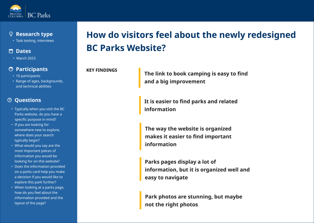
How do visitors feel overall about the newly redesigned website?
“The new site is fantastic. I think you did an awesome job so far. It is so much better than the last website. Big improvement!” – Research participant
“Now it’s so user friendly that I can just go on here. I can access anything I want.” –Research participant
What do visitors do, and what tools or websites do they use, when planning a trip to a park?
What questions were we trying to answer?
We wanted to know:
- Where does a search for a new park begin?
- What does the research process look like?
- What information is important when choosing a park to visit?
Researching a new park begins on other websites.
“I want to find out what parks are in a three-hour radius.” – Research participant
“Is the park where I want to be, and does it have the things I’m interested in?” – Research participant
“I would use Google first to look at others’ reviews, photos, and the areas around the park.” – Research participant
“Once I decide it’s the right location, I will go to bcparks.ca to do further research.” – Research participant
Key Findings:
Generally, searches for new parks begin on external websites. Common sites used are:
- Google Maps
- All Trails
- Tourism pages
The first things people want to find out about a park are:
- Where is the park located? Is it close to an area I want to be?
- What does the park look like (by viewing park photos)?
- What hiking trails does the park have?
- What are other people’s opinions of the park?
Once people have a list of parks they are interested in, they will often go to the BC Parks website to find out more information, such as:
- Facilities and amenities that are important to them
- Camping information and campground maps
- Maps of hiking trails
- What makes the park special
What were our key findings about the information provided on the park search results page?

What questions were we trying to answer?
We wanted to know:
- Is the park search result displaying the right information?
- Does the information provided help visitors to decide whether to investigate this park further?
- Is there any information missing that is important to them?
Participants identified one key piece of missing information from the parks search results.
“What this doesn’t tell me is where it is. It would be nice to have some indication of location.” – Research participant
Key Findings:
- All participants felt the park search results are missing the location of the park. The most important piece of information people need to make a decision is whether the park is close to where they want to be.
- Most people said the information provided on the park search results is helpful for determining if they would like to know more about the park.
- People felt the lists of facilities and activities give a good overview of what the park offers, but they had difficulty reading the long list in the way they are displayed.
- Many said that the advisories/alerts captured their attention, and they would want to learn more. However, they also said that they would be more likely to investigate an alert during flood or fire season. They would be less likely to investigate an alert when visiting the park for the day.
Photos are beautiful, but may not be the right kind of photos.
“That’s just the mountain. It could be anywhere.” – Research participant
“Photos are breathtaking. Fantastic. I’m a huge fan!”– Research participant
“It is showing me mainly the mountain structure, but my mind is thinking where would I camp? What does the environment look like?”– Research participant
Key Findings:
- All participants like seeing multiple photos on the park card and acknowledged how beautiful they are.
- People want to also see photos that show them what they can expect to see in the park. For example, they want to see photos of trailheads, campgrounds, unique features, and picnic areas.
What information is important to visitors when choosing a park to visit?
I want to know what a park has to offer.
“I’m specifically looking for activities, the facilities, and a park map.” – Research participant
Key Findings:
People want to know what the park has to offer and are typically looking for:
- Camping information. Dates of operation, how many campsites, how many first come, first served campsites, if there are cell service and Wi-Fi services, if campgrounds have potable water, and maps of the campground.
- What the campground offers. Trail system information, activities (for example, can I hike or paddleboard?), how big the park is, if it is dog-friendly, and maps of the park and trails.
- Park overview. A brief description of the park, what makes it unique, and where is it located.
Information is not organized in the way that I expected.
“I expected to see related information within the operating dates dropdown.” – Research participant
“I thought the campground section would include more details about camping and links to other relevant information.” – Research participant
“I would like a map or more information about that campsite. I don’t want to leave this section and go elsewhere for more information. I want everything related to the campground.” – Research participant
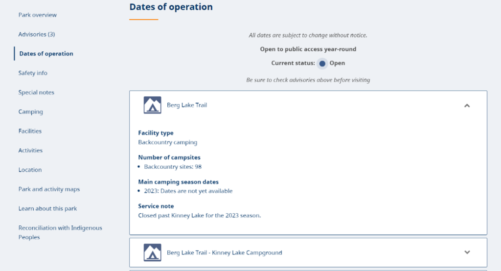
Key Findings:
- People’s expectations when opening a drawer in the operating dates section were that it would contain all relevant information to the topic.
- People want to see everything inside one drawer to help them find related information faster.
- People can find the information on the page by scrolling or using the left-hand navigation, but they would prefer information related to a specific area in the park grouped together.
Maps are important to me, but not all maps on the website are helpful.
“I want to know where the park is in the province.” – Research participant
“I want to see maps of the hiking trails.” – Research participant
“Maps affect anything I would decide to do in the park.” – Research participant
Key findings:
There are three types of maps on the BC Parks website:
- Park location map
- Park and park activity PDF maps
- Map of all park locations in B.C.
Location Map
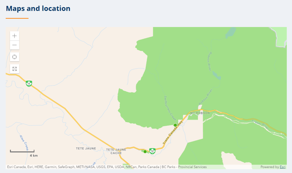
- People were frustrated with this map as it looks like it would be interactive, but it is not.
- All participants said they didn’t know what the dots represent as they are not labelled.
- People can accidentally scroll on the map, which zooms the map in or out. That causes them to lose their place and they are not able to reset it back to its original position.
- People felt if this map can’t be more interactive, then just a plain location map that doesn’t zoom would be a better choice.
Park and activity PDF maps
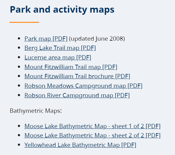
- Most people could easily find these maps and said they are the types of maps they seek out when researching a park.
- Some people missed the activity map section because it is at the bottom of the page, and they didn’t scroll down far enough.
- Several participants noted that older dates on some maps makes them question if the maps can be trusted.
Map of all park locations in B.C.

- People who are experienced using interactive maps liked this map and what it offers.
- Some less experienced map users felt overwhelmed by the map display and had difficulty figuring out how to navigate within the map.
What’s next?
- The design team is working on reorganizing information on the park pages based on the key insights identified during the research sessions.
- Search results cards are being redesigned based on feedback to better meet visitor’s needs.
- Feedback will be used to make future informed decisions around what information should be displayed on a parks page and what information can be removed.
More design research posts
Interested in design research at BC Parks? Don’t miss these posts:
- To learn how design research works and what research we’ve done during the past year, read A Year of Design Research at BC Parks.
- To see our findings about how people use the BC Parks website, read What do BC Parks visitors want from our website?
- To find out what people think about the camping reservation website, read How can we make it easier to reserve camping?
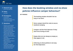
- To understand how policies affect people, read How do the booking window and no-show policies influence the campers behavior?
- To learn how people interact with the camping reservation system when searching for first come, first served campsites, read Camping Reservations service: First Come, First Served.
How can you take part in our research?
Start by participating in one of our live surveys:
Camping reservations survey
Have you made a camping reservation for the 2023 season? If so, we’re eager to hear what you think of the new site. Take the survey.
Volunteer for one-on-one research sessions
We are always looking for people who would like to take part in our design research activities. If you’re interested in one-on-one research, you can sign up using this form. We contact people from our (very long! we’re chuffed, thank you!) volunteer list at random, so we can’t promise that we’ll be able to talk to you for this type of research.

