How research guided our enhancement of park search on the BC Parks website
Categories:
BC Parks runs a program of ongoing design research that allows us to learn continuously from the people who use our products and services. In this blog, we share the findings of that research and how it influences what we do.
Earlier this year, we launched the new BC Parks website. But reaching the launch was just the beginning. The B.C. government’s digital code of practice asks us to continuously learn and improve. And that’s what the team responsible for the website has been doing.
One area that we knew would need more work was our find a park page. Our research told us that the find a park page is the first stop for people planning an outdoor adventure in B.C. Analytics tell us that this page gets more than 50,000 views per month in the summer. Such an important page deserves close monitoring to ensure it is meeting the needs of our visitors.
In this post, we share the visitor feedback we’ve heard about the find a park page, and the improvements we’ve made as a result.
Updated to Elasticsearch
Not to get too techie here, but the first step in implementing a more usable search experience was to upgrade the underlying technology. Our development team chose Elasticsearch because its features opened lots of design possibilities for us. It also returns search results faster and reduces the load on our database, making the site much more stable as a result.
Added location information
“What this doesn’t tell me is where it is. It would be nice to have some indication of location.” – Research Participant
“I would love help finding parks I didn’t know about in a certain region.” – Research Participant
To be honest, we did not really need user research to know that people need to know where a park is before they decide to visit. But our research participants did help us understand how they want to use location information and when it is most useful.
There are many ways to show location (on a map, distance from a landmark, region name, and so on). And different visitors want to see location information in different ways at different times.
Ultimately, our choice for this first step came down to data. What data did we have on hand that would also make sense to most website visitors?
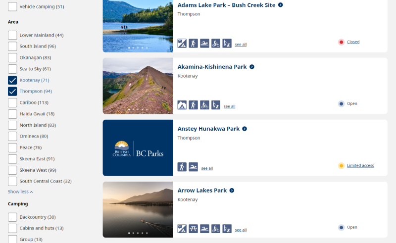
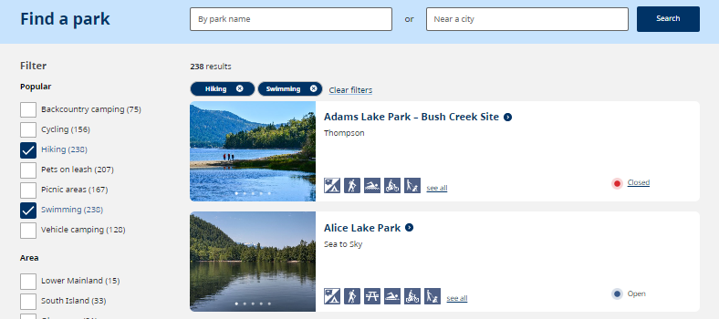
The park search results now show an area name alongside the park name. Next time you do a search, you’ll see one of these areas just below the park name on your search results:
- Lower Mainland, South Island, Okanagan, Sea to Sky, Kootenay, Cariboo, Haida Gwaii, North Island, Omineca, Peace, Skeena East, Skeena West, South Central Coast, Thompson
We also added filters for these areas. For example, you could choose to filter your results, so you see only parks on the South Island. Or you could look for parks in the Kootenay and Thompson areas.
Added city search
“I want to see parks 50 kilometres from either my current location or from a reservation that I already have booked, to plan the second portion of the trip.” – Research Participant
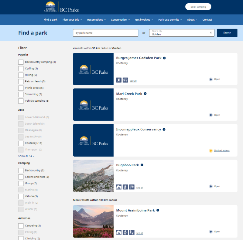
Having a location name is nice, but we also wanted people to be able to find parks near them, or near a city they are planning to visit.
Visitors can now search for parks near any city in B.C. This has been one of the top-requested features for the site as long as we’ve been doing user research, so we are thrilled that it’s now available.
By entering a city name into the search, visitors can see parks that have borders within a 50 km radius of that city. And, for visitors who cannot find anything suitable nearby, we also show parks up to 100 km away in a separate section.
Added search result counts
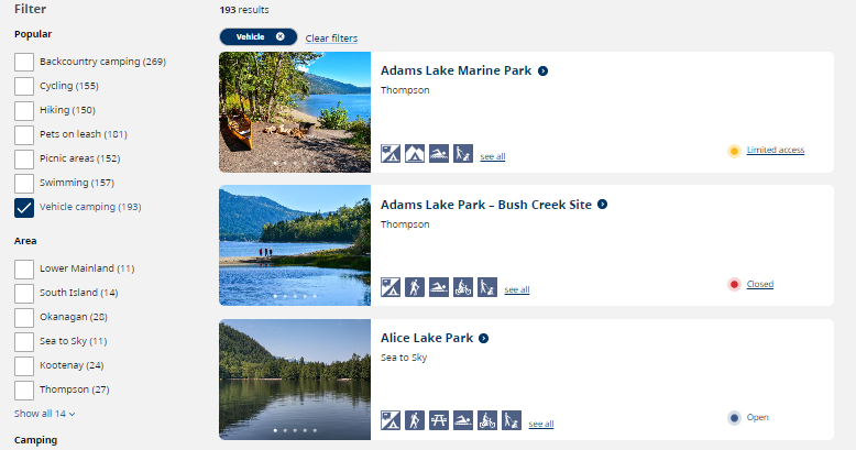
To make filtering easier, we added numbers next to the filters that show how many parks offer that activity.
For example, next to vehicle camping, the number tells visitors there are 193 parks that offer campsites you can drive to. After choosing that filter, visitors can see how many parks with vehicle camping are in the Okanagan (28). Clicking the Okanagan filter will leave 28 parks for the visitor to choose between.
This feature helps visitors narrow their search results enough to make the list manageable, without going so narrow that they end up with nothing to view.
Made camping filters easier to find
While we did have camping filters available on the original find a park page, they were a little hidden. We know that most of our site visitors are interested in camping, so we wanted to make it super easy to filter by type of camping.
To do this, we created a new section for camping filters. Visitors can now more easily find parks that provides these types of camping:
- Backcountry camping, cabins and huts, group camping, marine camping, vehicle camping, walk-in camping, winter camping
Simplified the activity and facility lists
“I’m looking at this. I’m overloaded by this information, and I’m lost.” – Research Participant
Previously, our search results showed a list of all activities and facilities in each park. It was tough for visitors to take in this much information on a single page.
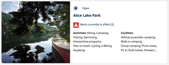
Aided by research, we learned that there were seven key activities and facilities that most people look for when trying to find a park to visit. These are:
- Vehicle camping, backcountry camping, hiking, picnic areas, swimming, cycling, pets on leash
Each park search result now shows only the most popular activities and facilities, displayed as easily recognizable icons. This way, people can tell immediately if the popular activity they are looking for is available in each park.
For visitors who have more niche interests, we included a link to the full list of park activities and facilities.

The popular activities are also available as filters. So, if you want to narrow your search to only parks where you can go hiking and then take a refreshing swim in a cold, clear body of water, you can do that.
Added and simplified park status
The term ‘park status’ refers to whether the park is open, closed, or in some other state like inaccessible, partial closure, or within a fire perimeter.
We wanted to add status to the park cards so people could quickly see if there was anything going on that could affect their trip. However, the existing statuses, like those listed above, were not all clear.
What does partial closure mean if I’m trying to go to the park? What’s the difference between inaccessible and closed? Can I visit a park in a fire perimeter?
To prevent this kind of confusion, we simplified our status messages so it’s easier for visitors to understand how their trip might be affected.
Our new statuses are:
- Open, closed, visit with caution, limited access, and permit required
For all statuses besides open, we also provide a link to park advisories for more information. This allows visitors to quickly find out why they should be cautious, or which parts of the park are off-limits.

Upgraded the design
Along with the major changes above, we also made many small tweaks to the page design. Most people will not consciously notice these changes, but they should make the page easier to use in lots of subtle ways.
These changes include:
- Adding an icon to make it clear that the park name on search results is a link
- Reducing the height of the search results so more are visible at a time
- Moving the number of search results to a more visible spot on the page
- Adding a way to clear search and filters with one click
- Making the message visitors see when their search does not have any results more helpful
- Improving filter design on mobile to make filters easier to use
- Increasing the size and updating the colour of filter checkboxes to improve accessibility
- Adding an A-Z list of parks as an alternative way to find a park


